Creating a peaceful and relaxing atmosphere in your home starts with the colors you choose for your walls, furniture, and decor. Calm colors can help reduce stress, improve focus, and make any space feel more inviting. Whether you’re redecorating a single room or your entire home, selecting the right palette is key to achieving a serene environment. In this post, we’ll share helpful tips to guide you in choosing calm colors that enhance tranquility and harmony in your living space.
Why Choose Calm Colors?
Colors have a strong psychological impact on our mood and energy levels. Calm colors often include softer shades with muted tones that evoke feelings of relaxation, comfort, and peace. These colors can:
– Reduce feelings of anxiety and tension
– Promote restful sleep when used in bedrooms
– Create a soothing environment ideal for work or meditation
– Complement other design elements without overwhelming the senses
Understanding the benefits of calm colors can guide you toward making intentional design choices that support your well-being.
Popular Calm Color Families
1. Blues
Blues are classic calming colors. Lighter blues remind us of the sky and water, which naturally bring tranquility. They help lower heart rates and reduce stress, making them ideal for bedrooms, bathrooms, and living areas.
2. Greens
Green symbolizes nature and growth. Soft greens promote relaxation and balance, while deeper greens feel grounding and stable. Green works well in almost any room, offering a refreshing and peaceful vibe.
3. Neutrals and Earth Tones
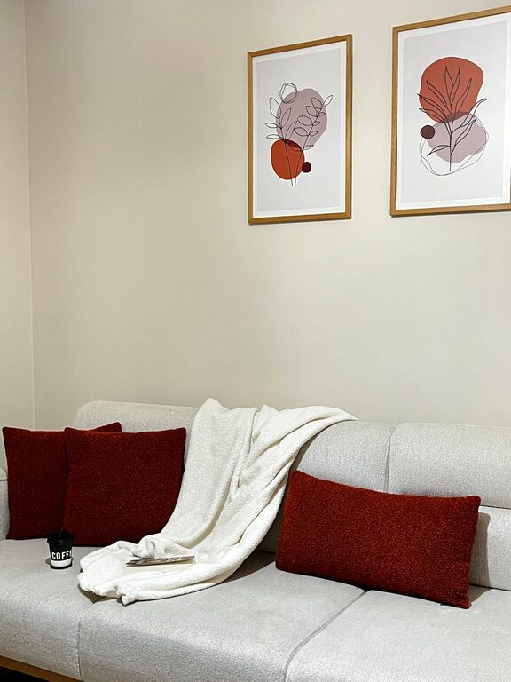
Shades such as beige, taupe, soft grays, and muted browns provide a warm and inviting ambiance. These colors create a perfect backdrop for other accents and furnishings, offering a subtle calm without overpowering.
4. Pastels
Gentle pastel shades, including blush pink, lavender, and pale yellow, introduce softness and lightness. They can be playful yet soothing when balanced with neutral tones.
Tips for Choosing Calm Colors for Your Home
Consider the Room’s Purpose
Start by thinking about how you’ll use the space. Calmer colors are ideal for:
– Bedrooms: Prioritize cool blues, subtle greens, or soft neutrals to foster restful sleep.
– Living rooms: Use warm neutrals or muted greens to promote relaxation and social comfort.
– Home offices: Choose shades that help focus without causing fatigue, like light greys or blues.
– Bathrooms: Soft blues or pale pastels evoke cleanliness and calm.
Matching color choices with the function of the room will support the intended mood.
Test Colors in Different Lighting
Colors can look very different depending on natural and artificial light. Before committing, test paint samples on your walls at various times of the day. Notice if the color feels too cold, dull, or overwhelming and adjust accordingly.
Choose Soft, Muted Shades Over Bright Tones
Bright colors like vivid reds or intense yellows tend to energize and stimulate rather than calm. Opt for muted tones with added gray, white, or beige to soften the appearance and create a more soothing palette.
Use a Color Palette for Balance
Incorporate multiple colors in different shades and textures to create visual interest while maintaining calmness. A good approach is the 60-30-10 rule:
– 60% dominant color (walls or large furniture)
– 30% secondary color (accent furniture or curtains)
– 10% accent color (decorative objects or cushions)
This balance ensures your space remains relaxing yet lively.
Consider Texture and Material
Color isn’t the only factor in a calm room. Textures and materials also affect mood. Pair calm colors with natural fabrics like cotton, linen, or wool to add warmth and comfort. Wood finishes and plants further enhance the relaxation vibe.
Don’t Forget White and Off-White
White and off-white shades help amplify natural light and offer a clean, open feel. They make calm colors stand out and prevent spaces from feeling cluttered or heavy.
Practical Advice for Implementation
Start Small
If you’re unsure about changing your entire home’s color scheme, begin with smaller accents like pillows, rugs, or curtains in calming shades. This approach lets you experiment without commitment.
Coordinate with Existing Decor
Take stock of your current furniture and artwork to find calm colors that complement, not clash. A consistent color story throughout your home feels intentional and peaceful.
Refresh Walls with Calm Paint
Painting walls is one of the most effective ways to introduce calm colors. Use low-VOC paint for a healthier environment and easier cleanup.
Use Lighting to Enhance Color
Soft, warm lighting makes calm colors feel even more inviting. Consider adding dimmable lights or lamps to adjust the mood as needed.
Examples of Calm Color Combinations
– Light gray walls with soft blue accents and natural wood furniture
– Pale green walls paired with cream textiles and rattan decor
– Warm beige walls, white trim, and blush pink accessories
– Soft lavender combined with light taupe and white linens
These combinations demonstrate how calm palettes can vary yet consistently produce serene atmospheres.
Final Thoughts
Choosing calm colors for your home is a wonderful way to foster peace and well-being. By understanding how colors affect mood and thoughtfully selecting shades that suit each room’s purpose, you can create a welcoming sanctuary where you feel relaxed and recharged. Remember to consider lighting, texture, and balance as you build your palette, and don’t hesitate to start small if needed.
With these tips, you’re well on your way to turning your home into a beautiful, calm retreat. Happy decorating!